One of the first things marketers learn is that symbols invoke emotions. A certain picture, color, or icon can make someone happy, sad, angry, and everything in between. Because of this, it's paramount that when creating a logo for a new business or company, executives make sure their company imagery has appropriate symbols.
That being said, even the most successful companies make mistakes.
Recently, Facebook introduced Libra, a cryptocurrency (Read about it in our past blog post here!). One of the main features that Facebook boasts about Libra is that it will be a stable coin, but there's one problem. Libra's logo is represented by three tildes (~), which is a punctuation mark typically used to notate "approximate." That isn't exactly the best symbolism for Libra, especially with cryptocurrencies' reputation for being extremely volatile.
If anything, this debacle teaches us that, as marketers and business people, we must always stay vigilant. No matter how comfortable our situation, we should always do our research and consider all possibilities.
Interested in learning more? Read Mark Wilson's article about the subject below.

The company’s new Libra currency features branding that’s very similar to an existing online bank. But that’s only the tip of the Zuckerberg.
By Mark Wilson | 6/20/19
This week, Facebook announced a new pseudo-cryptocurrency called Libra, which you can access through a Facebook spinoff company called Calibra. The currency’s logo is a tilde, or a “~” symbol. And as CNBC reports, it’s nearly identical to the logo of another online bank, founded in 2016, called Current.
So far, this is your typical convergent thought logo drama, similar to those already weathered by Silicon Valley startups like Airbnb. But there’s a twist, in this case: Both Current and Calibra used the same San Francisco design firm, Character, to create their logos. As a result, the world is left scratching its head, inventing weird conspiracy theories to explain what’s going on. For instance: Did Character think no one would notice if it copied its own idea?
Did Facebook hire Character because it wanted a clone of Current’s design? Is it all somehow a coincidence? To be honest, there’s no single trail of logic that makes any sort of satisfying sense.
I’d argue that ultimately, the “why” doesn’t really matter to the general public—and that we should be more concerned about Calibra’s design for another reason.

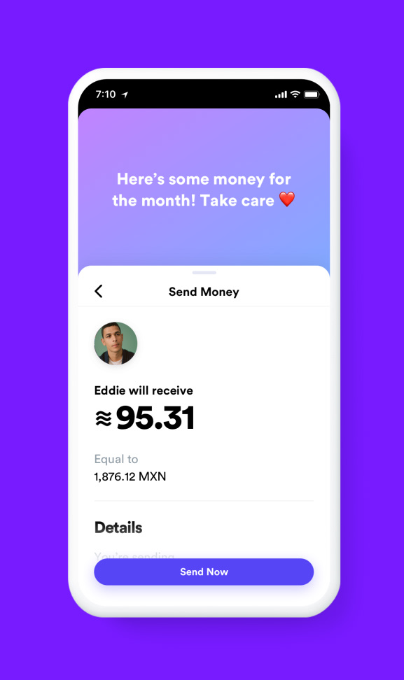
As you learned in grade school math class, using a tilde in front of a number implies its approximate value. So the logo strongly implies that the value of the currency Facebook is selling us on is uncertain in nature. Demoes of Facebook’s Calibra wallet app show how it turns $100 into ~95.31. The interface design states its value is actually only “about 95.31.” (The Libra currency itself uses a stack of three tildes rather than the single tilde used by Calibra’s logo. Yet, while I cannot render a stacked tilde here in type, as far as I’m concerned, that just means Libra is triple approximate in its value. “We have no idea what it’s worth!”—times three!).
I get it: Libra is supposed to be its own currency, so it needs its own symbol. And its value will constantly shift in relationship to USD or EUR or any other globally accepted currency standard. That’s how money works on the international scale. But Americans lost $5 billion by owning and trading Bitcoin in 2018, specifically due to its approximate value and incredible volatility. Sure, Libra is backed by real assets by more than two dozen founding members, while Bitcoin is not backed by anything but theoretical use cases. Yet, Facebook is positioning Libra as a much more accessible product—in fact, as a de facto payment method between friends and family members on Facebook, Instagram, and WhatsApp. It is the tool with which Facebook hopes to replace banks in nations around the world. With billions of potential customers already using these social networks, it’s hard to imagine the currency not succeeding at some tangible scale.
Which is why Libra’s brand language, based on approximate values, seems so inappropriate. Though perhaps Libra’s fuzzy symbology is doing its potential users a service: it says it’s about as dependable as Facebook itself.

Comments